Visualization Dashboard: A New Open Game Data Tool for Exploring Game Data
Up to now, Open Game Data infrastructure has made it possible to convert anonymous game play from educational games into events and use aggregators to process the events into features at session, player, and population levels. The logical next step was to build tooling for data visualization and analytics to allow exploration of the data.
Requirements for exploring educational game data
In 2024, Field Day Lab piloted an early prototype visualization tool that was designed to be teacher facing (Swanson & Gagnon, 2024). That project set the stage technically, but the team turned their attention to formally exploring other data visualization projects. “We tested whether existing solutions would support the game data use case and found them all lacking”, said Yuheng Chen, a product developer at Open Game Data. Looker studio has a highly interactive web interface and easy-to-share dashboards, but has rigid data requirements and limited visualization capabilities. Jupyter provides full control over visualizations and the ability to transform data directly, but requires python expertise and does not support presentations. Tableau provides support for many visualization types and also calculated fields, but it requires training and performance degrades with the larger datasheets common with game data. “ So that led us to formalize the requirements for a visualization tool for educational games,” he said.
Working with colleague Luke Swanson, a research intern in Field Day Lab at the University of Wisconsin, Yuheng interviewed educational game researchers and developers and developed a requirement set for a visualization tool, the first of which was that no coding expertise is required for users. “The tool needs to be intuitive to use,” Yuheng explained. In addition, the interviews revealed the following functional requirements:
Designed for rapid exploration of complex game data
Supports bespoke visualizations
Intuitively organizes charts
Functions with large datasets
Supports multiple levels of data aggregation
Enables sharing of data and analyses
Building a Prototype
On a recent Open Office Hour, Yuheng and Luke previewed a prototype of the Open Game Data Viz Dashboard. They showed how game data can easily be loaded into the interface, and then a new dashboard created.
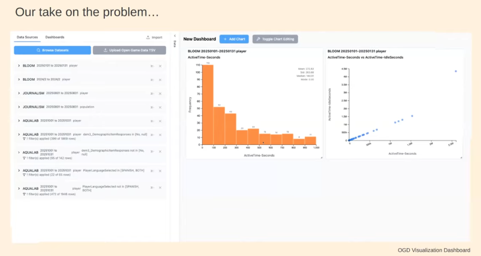
Figure 1. Viz Dashboard: Gameplay statistics display immediately upon file loading and can be adjusted easily using the toggle controls.
Yuheng and Luke demonstrated how the Viz Dashboard could be used to explore game data, live, as a team. They used data from Headlines and High Water, a game available on the Open Game Data repository, and used the Viz Dashboard to explore a series of questions.
Play Along
You can play along! We would like your feedback on the types of features, interface usability, and suggestions for further development.
Go to the Dashboard demo site, select the Headlines and High Water dataset, and walk through the series of visualizations. Start with basic statistics. How many players have played the game? How much time do players spend in the game, and what level did players attain? And you can filter the charts using the “Toggle Chart Editing” button.
Figure 2. Player statistics dashboard view. The view can be modified using the toggle button to select players reaching a specific level or playing for a specified duration.
The next aspect of game data you may want to explore may be player progression. Are there hot paths or common behaviors between players. For this, click on “Add Chart” and select the “Player Progression” feature. You can view overall how players are moving through the game, and you can zoom into any component of the game and view progression overall and by anonymous player code. Size of nodes and thickness of lines indicate the volume of players moving through that pathway.
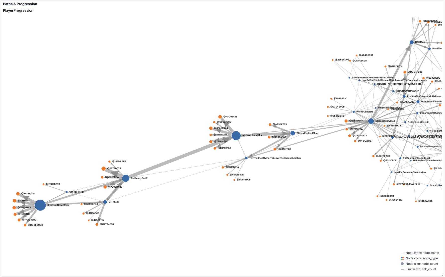
Figure 3. Player progression. Hub and spoke diagram showing player movement through the game. Hub diameter and spoke width are proportional to number of players in the path.
To explore progression questions at a player level, you can create a new chart, and select the “Player Attribute” feature. Here you can create charts to explore player endurance, research, trust, and other variables; you can also filter by time in the game and levels achieved and determine what game components were important in player progression.
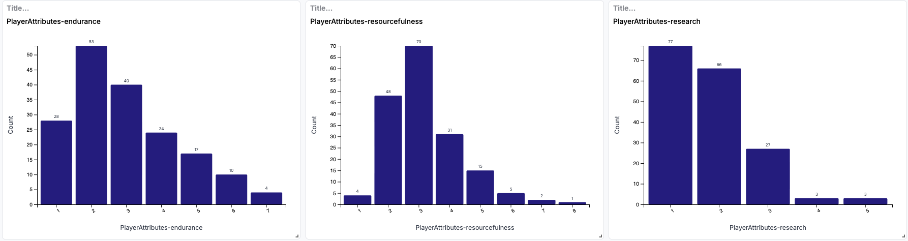
Figure 4. Player attributes. The Viz dashboard enables exploration of player attributes, including endurance, resourcefulness, and research.
We’d love to hear your thoughts on the Dashboard. You can send us comments at info@opengamedata.io, or register for the Open Game Data Slack workspace and start a group discussion.
Resources
References
Swanson L, Gagnon DJ, & Scianna J (2022). A Pilot Study on Teacher-Facing Real-Time Classroom Game Dashboards. Meaningful Play 2022 Proceedings. https://doi.org/10.48550/arXiv.2210.09427
Swanson L, Chen Y & Gagnon DJ. (2026). The Design of Data Visualization Tools for Educational Game Designers and Researchers. Meaningful Play 2026 Proceedings. (in review)